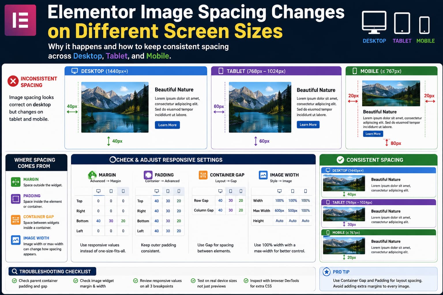
When image spacing looks correct on desktop but changes unexpectedly on tablet or mobile in Elementor, the image itself is often not the real problem.
The visible space around an image can come from several different places:
- the Image widget’s margin
- padding on the Image widget
- padding on its parent container
- the container’s Gap setting
- widget width or max-width
- container direction and wrapping
- responsive values inherited from a larger breakpoint
- custom CSS from the theme or another plugin
Changing random margin values until the mobile preview looks correct can create even more inconsistencies.
The better approach is to identify which element actually owns the space and then adjust only that setting for the necessary breakpoint.
Understand Margin, Padding, and Gap First
These three controls can all create visible space, but they do different jobs.
Margin
Margin creates space outside an element.
For example:
img-widget {
    margin-bottom: 30px;
}
pushes the next element away from the image.
Elementor describes margin as the space outside an element. Its documentation also warns that horizontal margins on top-level containers can make the layout wider than the viewport and cause overflow.
Padding
Padding creates space inside an element or container.
For example:
.image-container {
    padding: 20px;
}
creates space between the container edge and the image inside it.
Elementor defines padding as the internal spacing of an element.
Container Gap
If several widgets are inside a Flexbox Container, the distance between them may come from Gap, not from their margins.
For example:
Container
├── Image
├── Heading
└── Button
If the container has:
Gap: 30pxthat gap affects the spacing between all three elements.
Elementor specifically recommends using the container Gap control when arranging multiple elements and allows the value to be customized responsively.
So before changing an image’s margin, check the parent container.
Start With the Parent Container
Select the image and use Elementor’s Structure/Navigator panel to identify its immediate parent container.
Then inspect the container’s layout.
Pay particular attention to:
Direction
Gap
Justify Content
Align Items
Wrap
Width
Padding
Containers can use different directions at different breakpoints. A desktop row can become a column on mobile, which changes which gap direction becomes visually important. Elementor officially supports changing container direction independently for different breakpoints.
For example:
Desktop:
Direction = Row
Gap = 30px
might appear as horizontal spacing.
But on mobile:
Direction = Columnthe same conceptual element spacing now appears vertically.
That can make it seem as though an image suddenly gained bottom margin even though the image margin never changed.
Check the Container Gap on Each Device
Switch Elementor into responsive mode.
Check:
Desktop
Tablet
Mobile
Select the parent container and inspect Gap.
If desktop uses:
Gap: 40pxyou may not want the same value on a 375px-wide phone.
Set an intentional mobile value instead, for example:
Desktop: 40px
Tablet: 28px
Mobile: 20px
The exact numbers depend on the design.
Elementor’s own responsive container guidance demonstrates changing Gap between tablet and mobile layouts rather than expecting one value to work at every viewport.
The important principle is consistency, not using identical pixel values everywhere.
Check for Responsive Margin Values on the Image
Now select the Image widget itself.
In classic Elementor Editor v3, go to:
Advanced → MarginSwitch between desktop, tablet, and mobile.
Look for values such as:
Desktop:
Bottom = 30

Tablet:
Bottom = 50

Mobile:
Bottom = 0
If a value was accidentally entered at a responsive breakpoint, Elementor will preserve that separate device-specific value.
Elementor’s responsive settings are designed to store different values for each device. Its developer documentation confirms that desktop, tablet, and mobile values are stored separately when responsive controls are used.
If you do not need different margins, clear the unnecessary tablet or mobile override and let the value inherit.
Understand Elementor’s Responsive Inheritance
This is one of the most common causes of confusing spacing.
Elementor generally inherits responsive settings from larger screen sizes to smaller ones.
For example:
Desktop: 30px
Tablet: not explicitly set
Mobile: not explicitly set
means tablet and mobile may inherit the desktop value.
But if you set:
Tablet: 15pxthen mobile can inherit that tablet value unless you explicitly give mobile another value.
Elementor’s current responsive documentation confirms this larger-to-smaller inheritance behavior.
Therefore, when troubleshooting a mobile value, do not inspect only mobile.
Check:
Desktop → Tablet → Mobilein that order.
The mobile layout may be inheriting the unexpected value from tablet.
Check the Image Width and Max Width
Spacing problems are sometimes actually sizing problems.
Elementor’s Image widget provides controls for:
Width
Max Width
Height
and these affect how much space the image occupies relative to its container.
For example, a desktop image might use:
Width: 70%
Max Width: 500px
which leaves empty horizontal space around it.
On mobile, if it changes to:
Width: 100%the image fills the parent container and the apparent side spacing disappears.
Conversely, an image left at a small fixed width can appear to have excessive space around it on larger tablets.
A good responsive pattern is often:
Width: 100%
Max Width: 500px
Height: auto
with the parent controlling the overall available width.
Do not force a fixed image height unless the design specifically requires cropping.
Avoid Fixed Widths That Fight the Container
A setting such as:
Image width: 600pxmay look fine on a desktop but become awkward on a 768px tablet or 375px mobile screen.
Responsive units are often more appropriate:
%
rem
vw
depending on the design.
Elementor’s current sizing guidance recommends combining responsive widths with minimum or maximum constraints. Their example uses percentage width with minimum and maximum values to keep an image responsive without allowing it to become excessively small or large.
For many standard content images, something conceptually similar to:
width: 100%;
max-width: 600px;
height: auto;
provides more predictable behavior than a fixed desktop width.
Check the Parent Container Padding
If the image has:
Margin: 0but still has large empty space to its left and right, inspect the parent.
You may discover:
Desktop container padding:
Left 40px
Right 40px

Tablet:
Left 60px
Right 60px

Mobile:
Left 30px
Right 30px
That space belongs to the container, not the Image widget.
A useful layout strategy is to make outer page padding consistent across your site.
For example:
Desktop: 40px
Tablet: 30px
Mobile: 20px
Then use container Gap for spacing between elements.
This is generally easier to maintain than adding different margins to every individual image.
Check Whether Margin and Gap Are Both Being Used
A very common setup looks like this:
Container Gap: 30pxwhile the Image widget also has:
Margin Bottom: 30pxThe apparent space between the image and the next widget becomes roughly:
30px gap + 30px marginwhich produces significantly more space than expected.
It may look acceptable on desktop because there is plenty of room.
Once the container stacks vertically on mobile, the doubled spacing becomes obvious.
Choose one spacing system whenever possible.
For sibling elements inside the same container, Gap is usually cleaner than assigning individual margins to each widget.
Check Container Direction and Wrap
Suppose your desktop structure is:
Container: Row

[Image] [Text]
On mobile you probably want:
Container: Column

[Image]
[Text]
If the container remains a row, Elementor may shrink the widgets to fit the available width.
That can create unusual empty areas and make the image spacing appear incorrect.
Elementor specifically supports responsive container direction, width, ordering, and wrapping for this reason.
For a typical image-and-text section, check:
Desktop:
Direction = Row

Tablet:
Direction = Row or Column

Mobile:
Direction = Column
depending on the design.
Then set the Gap for each breakpoint.
Do Not Use Empty Spacer Widgets to Control Image Spacing
If the layout contains Elementor Spacer widgets between images and other content, consider replacing them with:
Container Gap
Padding
Margin
A fixed Spacer of:
80pxalways occupies 80px unless you separately change it responsively.
That often produces unnecessarily large blank areas on mobile.
Structural spacing controls are generally easier to maintain than inserting blank elements purely for layout.
Check the Actual Frontend, Not Only Elementor Preview
Responsive preview is useful, but always verify the published frontend.
Test at several widths, for example:
1440px
1024px
768px
480px
375px
Elementor’s default responsive model distinguishes desktop, tablet, and mobile based on viewport width, with the standard tablet/mobile transition around 767px. Elementor also allows additional breakpoints to be configured in Site Settings.
Drag the responsive preview width rather than checking only one predefined tablet size.
A layout that looks correct at exactly 768px might still break at:
850px
700px
430px
Responsive design should work throughout the range between breakpoints.
Check Your Elementor Breakpoints
Open:
Elementor Editor
→ Site Settings
→ Layout
→ Breakpoints
Elementor allows the default breakpoints to be customized and additional device breakpoints to be added.
If someone previously changed the breakpoints, your assumptions about “tablet” may not match what Elementor is actually generating.
For example, a site could have:
Tablet breakpoint: 1024px
Mobile breakpoint: 767px
plus additional breakpoints for:
Laptop
Tablet portrait
Mobile extra
Every additional breakpoint can potentially contain its own responsive spacing values.
Avoid adding extra breakpoints merely to fix one image unless the layout genuinely requires them.
More breakpoints mean more responsive states to maintain.
Inspect the Image With Browser DevTools
If Elementor’s settings all look correct but the frontend still has unwanted spacing, inspect the actual element.
Right-click the image and choose:
InspectLook at the browser’s Computed panel.
Check:
margin-top
margin-right
margin-bottom
margin-left

padding-top
padding-right
padding-bottom
padding-left

width
max-width
gap
row-gap
column-gap
Also inspect the image’s parent elements.
The browser may reveal that the space comes from:
.elementor-widget-image {
    margin-bottom: 20px;
}
or from your theme:
.entry-content img {
    margin-bottom: 2em;
}
or from custom CSS such as:
.my-image {
    margin: 50px 0;
}
If another stylesheet is winning, Elementor’s responsive control may not be the source of the problem.
Look for Theme or Plugin CSS
A WordPress theme or Elementor addon can apply global image rules.
For example:
img {
    margin-bottom: 20px;
}
or:
.entry-content img {
    display: block;
    margin: 30px auto;
}
These rules may not appear anywhere in Elementor’s interface.
DevTools will show:
- the property being applied
- the stylesheet that created it
- whether an Elementor rule was overridden
Do not immediately add !important.
First identify the rule that is creating the unwanted spacing.
A Clean Responsive Structure
For many image-and-text layouts, a simple structure works well:
Outer Container
    Padding:
        Desktop 40px
        Tablet 30px
        Mobile 20px

    Inner Container
        Direction:
            Desktop Row
            Mobile Column

        Gap:
            Desktop 40px
            Tablet 30px
            Mobile 20px

        Image Widget
            Margin: 0
            Width: 100%
            Max Width: appropriate design limit

        Content Container
            Margin: 0
This separates responsibilities:
Outer padding
= distance from page edge

Container gap
= distance between image and text

Image width
= image sizing

Widget margin
= exceptional adjustment only
That is easier to debug than distributing random margins across multiple widgets.
CSS Fallback for a Specific Image
If the layout requires custom CSS, assign the Image widget a CSS class such as:
responsive-feature-imageThen use:
.responsive-feature-image {
    margin-bottom: 32px;
}

@media (max-width: 1024px) {
    .responsive-feature-image {
        margin-bottom: 24px;
    }
}

@media (max-width: 767px) {
    .responsive-feature-image {
        margin-bottom: 16px;
    }
}
Use this only when Elementor’s native controls cannot produce the required result.
Do not add CSS just because the responsive settings have not yet been traced.
Elementor already provides device-specific spacing controls, and those should normally remain the first choice.
If the Image Itself Looks Like It Has Blank Space
Sometimes the “spacing” is actually inside the uploaded image.
For example, a PNG may contain transparent pixels:
┌─────────────────────┐
│ transparent space   │
│      IMAGE          │
│ transparent space   │
└─────────────────────┘
Elementor cannot remove that internal whitespace using margin or padding controls because it is part of the actual image canvas.
Open the media file itself and check its boundaries.
This is particularly common with:
- logos
- exported PNG graphics
- screenshots
- product cutouts
- graphics exported from Canva or Photoshop
Crop the source image if the blank area exists inside the file.
Elementor Editor V3 vs Editor V4
Elementor is currently transitioning to its Atomic Editor.
As of August 13, 2026, WordPress.org lists Elementor 4.2.1 as the current public release.
Some sites will therefore use the newer Editor v4 interface while many existing sites still use the familiar Editor v3 workflow.
The location and names of controls may differ, but the underlying troubleshooting principles remain the same:
identify the parent
→ identify who owns the spacing
→ check responsive inheritance
→ check width
→ check gap
→ inspect the frontend
Elementor provides separate current documentation for responsive editing in Editor v4 and Editor v3.
A Fast Troubleshooting Checklist
When one image has inconsistent spacing, check it in this order:
- Select the Image widget and reset unnecessary margin.
- Check Image width and max-width.
- Select the parent container.
- Check container padding.
- Check container Gap.
- Check responsive Direction and Wrap.
- Check desktop, tablet, and mobile inherited values.
- Verify the site’s breakpoints.
- View the real frontend at several viewport widths.
- Use DevTools if the spacing still cannot be explained.
Do not begin by changing all three of:
margin
padding
gap
at once.
If the problem disappears, you will not know which setting fixed it, and another breakpoint may break later.
How to Verify the Fix
After making the adjustment, test more than the three Elementor preview buttons.
Resize the viewport continuously.
Watch the distance:
page edge → image
image → adjacent text
image → next section
The spacing does not need to remain numerically identical on every device.
For example:
Desktop: 40px
Tablet: 30px
Mobile: 20px
can look much more visually consistent than forcing 40px everywhere.
The goal is a predictable spacing system that adapts to the available screen width.
