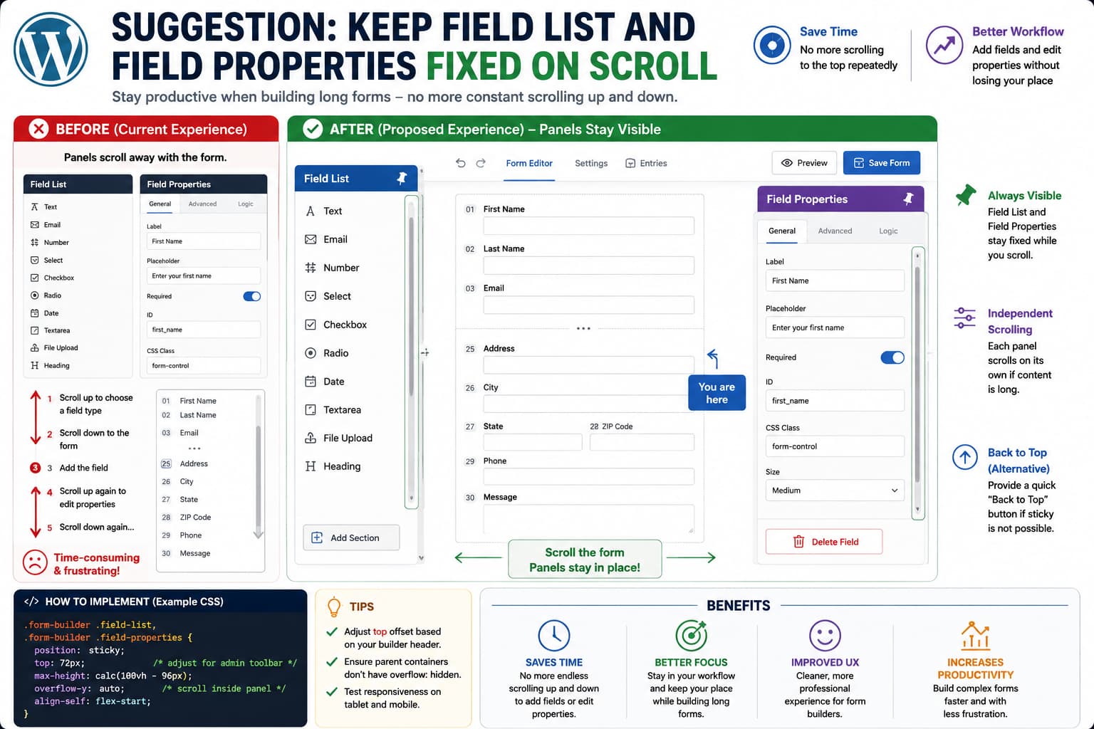
Building a short form with five or six fields rarely exposes problems with a form builder’s interface. The experience changes significantly when a form contains dozens of fields.
If the Field List and Field Properties panels sit at the top of the editor and scroll away with the form canvas, working near the bottom of a long form becomes unnecessarily repetitive.
The workflow becomes:
Edit field near bottom ↓Need another field ↓Scroll all the way to top ↓Choose field type ↓Scroll back down ↓Configure field ↓Repeat
A better form-builder interface keeps frequently used editing controls available while the form itself scrolls.
For a desktop builder with side panels, the most appropriate implementation is usually sticky positioning with an independently scrollable panel, rather than permanently fixing the panel to the browser viewport.
Why position: sticky Is Better Than position: fixed
It may seem natural to make the Field List permanently fixed:
.field-list { position: fixed;}
but fixed positioning removes the panel from normal document flow and positions it relative to the viewport. That can cause the panel to overlap the form builder, toolbar, WordPress admin menu, or other interface elements.
CSS provides a more suitable positioning mode:
position: sticky;
The CSS Positioned Layout specification defines sticky positioning as behaving like relative positioning until scrolling would move the element beyond its configured inset, at which point it remains constrained relative to its nearest scroll container.
For a form builder, that makes it possible to keep the panel inside its existing column while still keeping it visible.
Conceptually:
.form-builder-sidebar { position: sticky; top: 32px;}
The form can continue growing vertically without forcing the user to repeatedly return to the top.
The Better Layout for a Long Form Builder
A desktop form builder commonly has three logical areas:
┌────────────────┬─────────────────────────┬──────────────────┐│ │ │ ││ Field List │ Form Canvas │ Field Properties ││ │ │ ││ Text │ First Name │ Label ││ Email │ Last Name │ Placeholder ││ Select │ Email │ Required ││ Checkbox │ Address │ Conditions ││ Date │ ... │ Validation ││ │ │ │└────────────────┴─────────────────────────┴──────────────────┘
Only the center canvas really needs to become extremely tall.
The Field List and Field Properties panels are tools. They should remain readily accessible.
A practical implementation looks like this:
.form-builder-field-list,.form-builder-field-properties { position: sticky; top: 32px; max-height: calc(100vh-64px); overflow-y: auto;}
This accomplishes two different things.
position: sticky keeps the panels visible while the main editor moves, while max-height and overflow-y: auto allow a panel containing many controls to scroll internally instead of extending beyond the bottom of the screen.
Do Not Make the Panel Taller Than the Viewport
Adding only:
position: sticky;top: 32px;
can create another usability problem.
Suppose Field Properties contains 40 settings. The panel itself may be taller than the browser window.
Its top remains visible, but the bottom can become difficult or impossible to reach.
That is why the height constraint matters:
max-height: calc(100vh - 64px);overflow-y: auto;
Now the behavior becomes:
Main page scroll→ moves through form fieldsField Properties scroll→ moves through properties only
The two scrolling contexts remain separate.
Account for the WordPress Admin Toolbar and Builder Header
The correct top value depends on the editor.
If the builder has a persistent header such as:
WordPress admin toolbarBuilder toolbarSave button row
a value of:
top: 0;
may cause the sticky panel to disappear underneath that header.
For example:
.form-builder-sidebar { position: sticky; top: 72px;}
may be more appropriate.
The exact value should be based on the actual builder UI rather than copied from another plugin.
A More Complete Sticky Panel Pattern
A plugin developer could use a structure similar to:
.form-builder__sidebar { align-self: flex-start; position: sticky; top: var(--builder-sticky-offset, 32px); max-height: calc(100vh-var(--builder-sticky-offset, 32px) -24px ); overflow-y: auto; overscroll-behavior: contain;}
Using a custom property makes the offset easier to adjust when the builder header changes:
.form-builder {--builder-sticky-offset: 72px;}
Then both side panels can use the same value without duplicating it throughout the stylesheet.
Sticky Positioning Can Fail Because of a Parent Container
One reason developers sometimes add position: sticky and conclude that it “doesn’t work” is that sticky positioning responds to the surrounding scroll layout.
The CSS specification defines sticky offsets relative to the nearest relevant scrollport, not simply the browser window in every situation.
Therefore inspect the panel’s ancestors for properties such as:
overflow: auto;overflow: scroll;overflow: hidden;
For example:
<divclass="builder-wrapper"><asideclass="field-list"></aside><mainclass="form-canvas"></main></div>
If builder-wrapper is itself the scrolling container, the sticky panel will stick relative to that container.
That can actually be desirable, but it needs to be intentional.
Use align-self: flex-start in Flex Layouts
Many modern form builders use Flexbox.
For example:
.form-builder { display: flex;}
In that situation, a sidebar may stretch vertically because of the container’s alignment rules.
Adding:
.field-properties { align-self: flex-start;}
helps ensure that the panel retains its content height, which is generally the desired geometry for a sticky sidebar.
A full example might therefore be:
.form-builder__field-list,.form-builder__properties { align-self: flex-start; position: sticky; top: 72px; max-height: calc(100vh-96px); overflow-y: auto;}
An Independently Scrolling Sidebar Can Be Even Better
For sophisticated builders, the most usable architecture may be to avoid document-level scrolling almost entirely.
For example:
.form-builder { display: grid; grid-template-columns: 260pxminmax(0, 1fr) 320px; height: calc(100vh-72px); overflow: hidden;}.form-builder__field-list,.form-builder__canvas,.form-builder__properties { overflow-y: auto;}
The result behaves more like a desktop application.
The browser window remains stable while each major workspace handles its own content:
Field List→ scrolls independentlyForm→ scrolls independentlyField Properties→ scrolls independently
For very large form builders, this can be more comfortable than making everything part of one long WordPress admin page.
Preserve the Current Form Position When Adding Fields
Sticky panels solve only one part of the UX problem.
When a user is editing field 42 of a 60-field form and clicks Add Text Field, the builder should ideally insert the field near the current working position rather than jumping the canvas back to the beginning.
A good workflow would be:
Select field 42 ↓Field Properties stays visible ↓Choose Text from sticky Field List ↓New field inserted after field 42 ↓Canvas remains at field 42/43
That eliminates unnecessary scroll restoration altogether.
Keep the Selected Field Visible Too
Another useful enhancement is to preserve selection state while the properties panel remains sticky.
When the user clicks:
Billing Address
the Field Properties panel should continue showing Billing Address even while the center canvas moves.
Changing scroll position should not implicitly deselect the field.
The panel therefore becomes a persistent inspector rather than simply another section of a long page.
A Back-to-Top Button Is a Useful Fallback
If changing the builder layout is not currently practical, the original suggestion of providing a quick navigation control is still useful.
For example:
↑ Back to Field List
or simply a persistent:
↑
button.
A lightweight implementation could use:
document.querySelector( '.field-list' )?.scrollIntoView( { behavior: 'smooth', block: 'start'} );
That does not provide the same usability improvement as sticky panels, but it removes the worst part of repeatedly manually scrolling through a large form.
For accessibility, an icon-only arrow should have an accessible name such as:
<buttontype="button"aria-label="Back to field list"> ↑</button>
A Temporary Admin CSS Workaround
If the particular form builder exposes stable HTML classes, a site administrator can sometimes implement sticky behavior without modifying the plugin.
First inspect the Field List with DevTools.
Suppose its wrapper is:
<divclass="my-builder-field-list">
and the properties panel is:
<divclass="my-builder-field-properties">
Test this directly in DevTools:
.my-builder-field-list,.my-builder-field-properties { position: sticky; top: 72px; max-height: calc(100vh-96px); overflow-y: auto;}
If it behaves correctly, the CSS can be loaded on that WordPress admin screen through a small plugin or mu-plugin.
WordPress provides admin_enqueue_scripts specifically for loading scripts and styles in the administration area, and the hook supplies the current admin screen suffix so assets can be restricted to the required page instead of being loaded throughout wp-admin.
For example:
<?phpif ( 'admin.php'!==$hook_suffix ) {return; }wp_register_style('form-builder-sticky-panels',false, [],'1.0.0' );wp_enqueue_style('form-builder-sticky-panels' );wp_add_inline_style('form-builder-sticky-panels',' .my-builder-field-list, .my-builder-field-properties { align-self: flex-start; position: sticky; top: 72px; max-height: calc(100vh - 96px); overflow-y: auto; } ' ); });
The selectors above are examples only.
Do not paste this unchanged without identifying the actual form-builder wrappers first.
Why Admin CSS Is Better Than Editing the Plugin
Do not open the plugin’s compiled stylesheet and permanently add:
position: sticky;
there.
The next plugin update can overwrite the modification.
A small admin-only override is easier to remove once the plugin implements sticky panels natively.
It also keeps the installed plugin files identical to the official release.
Disable Sticky Behavior on Narrow Screens
Three permanently visible columns are useful on a large monitor but can be frustrating on tablets.
The implementation should therefore have a responsive fallback.
For example:
@media (max-width: 1100px) { .form-builder__field-list, .form-builder__properties { position: static; max-height: none; overflow: visible; }}
Another approach is to turn the two sidebars into slide-out drawers on smaller displays.
The key point is that “always visible” should apply when screen space permits rather than forcing desktop behavior onto every viewport.
Sticky Is Preferable to an Always-Fixed Overlay
There is an important UX difference between these:
position: fixed;
and:
position: sticky;
Fixed positioning is detached from normal flow, while sticky positioning remains associated with its containing layout and only adjusts its position during scrolling. The W3C positioning specification defines these as separate positioning schemes.
For form-builder side panels, sticky usually requires fewer compensating width, margin, and overlap rules.
The Source Request Does Not Identify the Form Builder
The original feature request describes Field List and Field Properties panels but does not identify the WordPress form plugin.
Because those names are used by multiple form-building interfaces, it would be unsafe to publish a plugin-specific CSS selector or claim that a particular plugin currently has or lacks this feature.
The correct implementation must therefore begin by inspecting the specific builder’s DOM.
A useful implementation checklist is:
- Identify the Field List and Field Properties wrapper elements in DevTools.
- Test
position: stickybefore changing plugin files. - Account for the WordPress/admin builder header with an appropriate
topoffset. - Limit tall panels with
max-heightandoverflow-y: auto. - Check parent overflow rules if sticky positioning does not activate.
- Scope any custom admin CSS to the form-builder screen only.
- Disable or redesign sticky sidebars at narrow breakpoints.
- Remove the workaround when the plugin adds native support.
What Plugin Developers Should Implement
The cleanest long-term behavior would be:
DesktopField List = sticky/scrollableForm Canvas = independently scrollableField Properties = sticky/scrollableTabletField List = collapsible drawerForm Canvas = main workspaceField Properties = collapsible drawerMobileOne panel at a time
That solves the actual workflow problem rather than merely adding a “Back to Top” shortcut.
For users building long forms, the Field List and Field Properties are primary editing tools. Making them disappear because the form has become long forces unnecessary navigation into virtually every field-editing action.
How to Verify the Improvement
Create a test form containing enough fields to extend several screens below the fold.
Scroll to one of the final fields.
The expected workflow should now be:
Field List remains accessibleField Properties remains accessibleCurrent form field remains in view
Add another field, edit its properties, and continue working without manually returning to the top of the page.
Also test the panel with enough properties to exceed the viewport height. The panel itself should become scrollable rather than extending beyond the screen.
Finally, test a smaller laptop and tablet-sized viewport to ensure the sticky panels do not overlap the form canvas.
