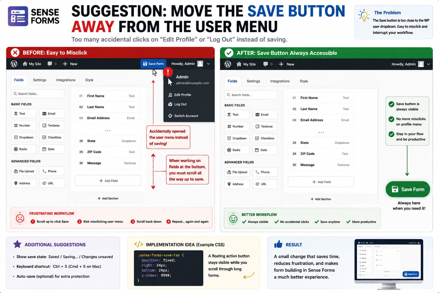
When rebuilding a large form in Sense Forms, the Save button is one of the controls you use most frequently.
If that button sits immediately beside the WordPress user menu in the upper-right corner of wp-admin, however, a small positioning problem can become a repetitive workflow issue.
The WordPress toolbar places the current-user account menu in that same area. Clicking slightly too far can therefore open:
Edit ProfileLog Out
instead of saving the form.
For someone making dozens or hundreds of changes while rebuilding long forms, that becomes more than a cosmetic complaint. The primary action and an unrelated account-navigation control are competing for the same click target.
Sense Forms is specifically built around a visual drag-and-drop form editor, so making the main Save action easier to reach would fit the workflow of the builder itself. The current public Sense Forms release is 1.7.8, and its WordPress.org listing describes the visual form builder as one of the plugin’s core features.
A better design would be to keep Save available as a persistent action near the bottom of the screen, away from the WordPress account menu.
The Current Workflow Problem
The issue is easiest to understand visually:
┌─────────────────────────────────────────────────────────────┐│ WordPress Admin Save Howdy, User ▼ ││ ↑ ││ very easy to hit instead │└─────────────────────────────────────────────────────────────┘
The two controls perform completely unrelated actions:
Save→ preserve current form changesUser menu→ account/profile/logout actions
Yet they occupy the same small area of the interface.
When Save is clicked repeatedly during a long editing session, even a small number of accidental account-menu clicks interrupts the workflow.
The problem becomes worse if the account dropdown remains open after the mistaken click because the user then has to dismiss it before returning to the builder.
Better Option: A Floating Save Button
A strong alternative would be:
┌─────────────┐ │ Save Form │ └─────────────┘ ↑ bottom-right
The button could remain visible while the user:
- adds fields,
- scrolls through a long form,
- edits field properties,
- changes validation,
- configures notifications,
- or adjusts form styling.
Instead of locating Save beside WordPress’s account controls, Sense Forms could make it a persistent builder action.
CSS fixed positioning is specifically designed to keep an element at a stable position relative to the viewport rather than letting it scroll away with ordinary document content. (w3.org)
Conceptually:
.sense-forms-save { position: fixed; right: 24px; bottom: 24px; z-index: 1000;}
The exact selector and offsets would need to match Sense Forms’ actual builder markup.
Keep the Existing Save Button Too
The safest implementation does not necessarily need to remove the existing top Save button.
Sense Forms could provide both:
Top toolbar→ SaveFloating action→ Save
with both triggering the same save routine.
That provides several benefits.
Users already accustomed to the existing button do not need to relearn the editor, while users working farther down long forms gain a persistent action.
The floating button should not implement a separate save process. It should call the same underlying handler so there is only one definition of what “Save” means.
Conceptually:
functionsaveForm() {// Existing Sense Forms save logic.}topSaveButton.addEventListener( 'click', saveForm );floatingSaveButton.addEventListener( 'click', saveForm );
This avoids situations where one Save control behaves differently from another.
The Button Should Show Save State
A floating Save button becomes even more useful if its state communicates whether the form has unsaved changes.
For example:
No changes:[ Saved ]Changed:[ Save Form ]Saving:[ Saving... ]Completed:[ ✓ Saved ]Error:[ Save Failed - Retry ]
That removes another common form-builder uncertainty:
Did I already save this change?
For a form with many fields and settings, visible save status is valuable because users may make changes in several different panels before returning to the form list.
Only Highlight Save When Something Changed
The floating control does not need to remain visually dominant all the time.
A good interaction pattern would be:
Form unchanged→ muted "Saved"User edits a field→ primary-colour "Save Form"Save starts→ disabled "Saving..."Save succeeds→ green check / "Saved"
That gives the button a second role as an unsaved-changes indicator.
Avoid Covering Sense Forms’ Support Button
The feature request specifically suggests making Save float at the bottom in a similar way to the existing ? support control.
That is a sensible location, but the two controls should not overlap.
For example:
[?] [ Save Form ]
or:
[ ? Help ] [ Save Form ]
The builder could reserve separate corners:
Bottom-left→ HelpBottom-right→ Save
That keeps both high-frequency actions accessible without stacking interactive elements on top of each other.
A Small Floating Action Bar May Be Even Better
Instead of a single circular or floating button, Sense Forms could use a small action dock:
┌─────────────────────────────────────┐│ Unsaved changes Preview Save │└─────────────────────────────────────┘
fixed to the bottom of the editor.
This is particularly useful if the builder already has other frequent actions.
For example:
PreviewUndoRedoSave
could remain available without placing them beside WordPress-level navigation.
The key is to keep form actions inside the form workspace and WordPress account actions inside the WordPress toolbar.
Why Simply Moving It Left Would Only Partially Help
Another possible solution is:
[ Save Form ] Howdy, User
with significantly more space between the controls.
That would reduce accidental clicks.
However, it would not solve another problem with large forms: if the builder header scrolls away, Save may become unavailable while working lower down the page.
A persistent bottom control solves both:
accidental profile-menu clicks+Save disappearing during long-form editing
with one interface change.
Alternative: Make the Builder Header Sticky
If Sense Forms prefers keeping Save in the header, another reasonable architecture is to make the entire builder toolbar sticky.
For example:
.sense-forms-builder-toolbar { position: sticky; top: 32px; z-index: 100;}
Then place Save comfortably away from the WordPress account menu within that toolbar.
The difference is:
Sticky header→ Save stays at top of builderFloating button→ Save stays in bottom corner
Either can work.
For a single high-frequency action, however, the floating Save control requires less persistent screen space.
Temporary CSS Workaround
Because Sense Forms is new and the public documentation does not expose a supported setting for repositioning the builder’s Save control, any admin-side workaround should begin by identifying the real button selector in DevTools rather than guessing it. The current public release is 1.7.8, described by WordPress.org as the initial public release.
Open the Sense Forms builder, right-click Save, and select:
Inspect
Suppose, purely as an example, the button had:
<buttonclass="sense-form-save-button"> Save Form</button>
You could test:
.sense-form-save-button { position: fixed; right: 24px; bottom: 24px; z-index: 99999;}
directly in DevTools.
Do not use that selector unless your installed version actually contains it.
The goal of the test is to determine whether moving the existing button can be done without disrupting its JavaScript save behavior.
Account for the WordPress Admin Menu
A fixed control should also work when the WordPress admin sidebar is:
expandedcollapsed
and at common viewport sizes.
The easiest approach is generally to anchor the button to the right side of the viewport rather than using a hard-coded distance from the left.
For example:
right: 24px;bottom: 24px;
continues to make sense regardless of the WordPress menu width.
Mobile and Small Laptop Screens Need a Different Layout
A floating button that looks comfortable on a 27-inch desktop monitor can cover content on a small laptop.
A responsive version might use:
@media (max-width: 782px) { .sense-form-save-button { right: 12px; bottom: 12px; }}
Or Sense Forms could switch to a full-width bottom action bar:
┌───────────────────────────┐│ Save Form │└───────────────────────────┘
on narrow screens.
The objective is to keep Save reachable without covering Field Properties or other builder controls.
The Save Button Should Remain Keyboard Accessible
Moving the button visually should not turn it into a mouse-only feature.
It should remain a normal:
<buttontype="button">
control rather than a clickable <div>.
Keyboard focus should remain visible, and pressing Enter or Space while the button has focus should trigger the same save action.
If Sense Forms duplicates the Save control instead of moving it, both instances should have clear accessible labels.
Consider a Keyboard Shortcut Too
A persistent button could be combined with:
Ctrl + S
or:
Cmd + S
on macOS.
The builder could intercept the shortcut while its editor is active:
document.addEventListener( 'keydown', function ( event ) {if ( ( event.ctrlKey ||event.metaKey ) &&event.key ==='s' ) {event.preventDefault();saveForm(); }} );
This should be treated as a convenience feature, not a replacement for the visible Save button.
Users should never have to know a keyboard shortcut simply to preserve their work.
Autosave Would Solve an Even Larger Part of the Problem
Longer term, Sense Forms could also consider autosave.
For example:
User changes field ↓Builder becomes dirty ↓Wait 1–2 seconds ↓Autosave ↓"Saved" indicator
The manual Save button should still remain available.
Autosave provides additional protection when users:
- accidentally close the page,
- click another WordPress menu,
- follow Edit Profile by mistake,
- or navigate away before manually saving.
However, autosave requires careful handling of partially entered settings, errors, concurrent updates, and network failures. Moving the Save button is a much smaller and safer UI change.
Do Not Solve This by Hiding the WordPress User Menu
Technically, someone could hide:
Howdy, User
from the WordPress toolbar.
That would reduce accidental clicks but remove legitimate WordPress functionality merely to accommodate the location of one plugin button.
The better fix is to move or reposition the form-builder action.
A plugin’s high-frequency Save control should not require users to remove standard WordPress navigation.
Suggested Sense Forms Layout
A cleaner desktop arrangement could be:
┌──────────────────────────────────────────────────────────┐│ Sense Forms Form Name Preview │├──────────────────────────────────────────────────────────┤│ ││ Field List Form Canvas Field Properties ││ ││ ││ ││ [? Help] ││ [ ✓ Save Form ] │└──────────────────────────────────────────────────────────┘
The WordPress account menu can remain in its normal toolbar above the builder without competing directly with Save.
How Plugin Developers Could Implement It
A minimal implementation can preserve the current button and add a second action.
Conceptually:
<buttontype="button"class="sense-forms-floating-save"> Save Form</button>
with:
.sense-forms-floating-save { position: fixed; right: 24px; bottom: 24px; z-index: 1000; padding: 12px20px; border-radius: 8px;}
Then bind it to the builder’s existing save function.
A more polished version would include:
dirty-state detectionsaving statesuccess stateerror stateresponsive positioningkeyboard support
but the core change does not require redesigning the form builder.
Version Note
As of August 15, 2026, WordPress.org lists Sense Forms 1.7.8 as its current public release, with WordPress 6.2+ and PHP 7.4+ requirements. The public changelog currently describes 1.7.8 as the plugin’s initial release.
The published documentation confirms Sense Forms has a visual drag-and-drop builder and form-specific Style controls, but I could not find a documented option for moving or floating the builder’s Save control.
That makes this best treated as a builder UX feature request, not a configuration problem users are currently overlooking.
Why This Is Worth Fixing
The Save button is different from a rarely used configuration control.
During a long editing session it may be clicked repeatedly.
The cost of a poorly positioned low-frequency button is small.
The cost of a poorly positioned primary action accumulates every time the user edits the form.
A floating Save button would:
reduce accidental profile-menu clickskeep Save available while scrollingmake unsaved state easier to communicatereduce unnecessary pointer movementkeep WordPress navigation separate from form actions
For people rebuilding large forms, those small improvements add up quickly.
